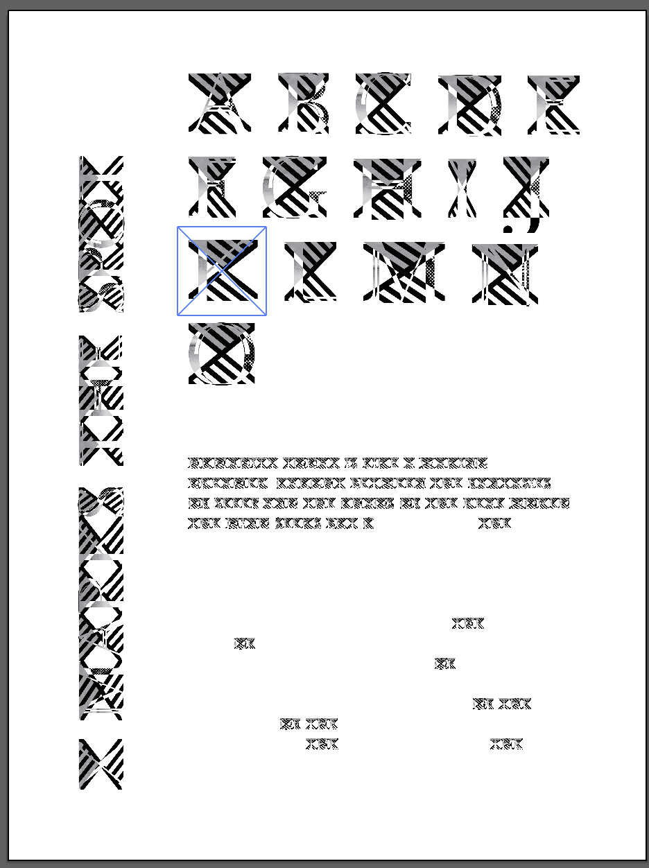
X Marks the Spot, is a typeface designed using systems theory. I started with Baskerville and followed a list of ambiguous prompts to edit the typeface to make it not distinguishable to Baskerville. To start the typeface I used the letters A, M, and S, since they have the most common components within them. When designing AMS it was important to keep in mind how each edit would apply to a system to design the rest of the alphabet. The key learning objective of this project was working and creating systems that hold up over many situations. After designing the typeface I designed a poster to showcase it. Below you’ll find the alphabet designed, a paragraph showing the typeface in use, as well as in progress sketches. This typeface went through many variations before finding the right one, including starting over. All important parts of the process.


